Thursday, October 28, 2004

Component Linking

WARNING: This blog entry was imported from my old blog on blogs.sun.com (which used different blogging software), so formatting and links may not be correct.


One of the new designer features that's available in patch 3
is "component linking". This lets you easily link two related components
together. If you've ever dropped a database table on a dropdown or
Data Table component, you've used component linking. When you dropped,
the rowset was linked to the JSF component (by becoming its data source
through value binding).


Component linking isn't specific to data binding. Take the "Inline
Message" component for example, which displays messages for other
components. The for property points to which component
it displays errors for. If it's tied to a text field for example, and
the text in the text field fails to validate, the validator error
message is displayed in the inline error message.


In 1.0, if you drop an Inline Message, it just displays the text
"msg-summary" (and if you enable the details property on the
component, it would display "msg-summary msg-details"). Not
particularly helpful. I got inspired to fix this when I deployed my application
several times without validation messages showing up, and I (too late) realized
that I had forgotten to associate the inline error message component with
its textfield!! This is now changed such that it will
instead display "Messages for id", where id is the name
of the component it's bound to. Therefore, you can immediately tell whether
your Inline Message is set up correctly, and which component it's associated with.


You change the component it's bound to
by editing the "for" property of the component.
As of patch 3, you can now easily link these components (an Inline
Message, and its associated component, such as a text field). Just
control-shift drag from the textfield to the inline message (or vice
versa), and the two components are linked! As you can see from the
screenshot, there is feedback while you drag; when a link connection
is possible the target is highlighted in blue and the status text area
describes the link. (The screenshot program I used inserted its own
mouse pointer here rather than the one used by Creator during the link
operation.)


Other components allow links too; for example, you can connect
any visual component (other than self) to a Component Label component
using the same technique.


In addition, linking works in the application outline too.
You can now reorder components by simply dragging them around in
the application outline (see screenshot). Normally, if you drag
say a component label component to a Grid Panel, it's going to
move the label into the Grid Panel. How can you link the label
to the grid panel instead, such that it's a label for
the grid panel rather than in it? Hold down Control-Shift
during the drag. The Drag & Drop cursor will change to the
link cursor. Another modifier will cause the component to be
copied rather than linked or moved. The keyboard modifiers should
be the same as the drag & drop modifiers used for file manipulations
on the operating system you're running on.


Monday, October 25, 2004

Creator Patch 3 Available

WARNING: This blog entry was imported from my old blog on blogs.sun.com (which used different blogging software), so formatting and links may not be correct.


Patch 3 has hit the update center. You'll definitely want to get this update; it contains a lot of bug fixes. And some new features too. Look in your your Tools menu for the Update Center.


I'll come back and blog more about the new stuff in patch 3 in a day or two.... today's my birthday so I took the day off. And now it's too late to stay up and blog!


Monday, October 18, 2004

Building a Browser

WARNING: This blog entry was imported from my old blog on blogs.sun.com (which used different blogging software), so formatting and links may not be correct.


My biggest challenge is to make the Creator page designer properly display "real" web pages, and more importantly, display them the way browsers do. It should be simple, right? I thought I'd start with the Google page -- that's a very small, simple HTML page. But even that page exposed a problem in the designer: it surrounds its main table with a <center> tag (an inline tag containing a block tag, something which shouldn't be valid) - but browsers actually use this to not just center text via the CSS property text-align: center, they actually center block tag children like the table as well. Grrrrr... I'll have to work on that; looks like Mozilla is using clever vendor specific CSS properties to handle <center> right.


But I've spent some time the last couple of days trying to improve rendering of various pages. The Sun home page renders pretty well now as you can see from the screenshot on the left; my blog page does too (bottom right).


I'm definitely not done in this department. Various bugs in my handling of floating boxes means that the Amazon page (which relies heavily on them) looks terrible. I'll attack that next.


I spent some time trying to get the MSDN page to look okay. It looked terrible and I couldn't figure out why: all the fonts were microscopically small!! Turns out Microsoft were using percentages for the CSS font-size property, and not only that, if the page is rendered correctly (as in following the CSS standard) the fonts SHOULD be small. But they're relying on a quirks mode behavior (which Mozilla supports) where if a document doesn't specify a modern DOCTYPE, font size inheritance is turned off when you go through a table tag. I had a really hard time figuring this out, and in the end I resorted to using Mozilla's DOM inspector (I love that tool!) to compare notes for their computed effective styles and my effective styles, and that's when I discovered how CSS properties are inherited in quirks-mode processing of documents. In the end I decided not to worry about this (supporting quirks mode in the designer): we already require you to write XHTML compliant markup, so you should be relying on standard CSS handling.


P.S. Notice how in the third screenshot (you can click on the thumbnail images) the output window has opened and told me that my CSS property value for "font-weight", "medium", is not a valid value for font-weight. The intended value is "normal", not "medium". I hadn't noticed that until loading the page into Creator just now! I guess I should use Creator to edit my blog from now on... we just need to integrate Creator with Roller...


Friday, October 15, 2004

Writing from my couch... finally....

WARNING: This blog entry was imported from my old blog on blogs.sun.com (which used different blogging software), so formatting and links may not be correct.


I finally fixed my home wireless network. I work at home three days
a week, and my home office is in the garage. The problem is the wireless
router's signal only barely reaches into the house -- so when I try to
sit on the couch with my laptop I can't actually be online. And thanks
to Murphy's Law, if I'm not online I'll definitely run into some issue
where I need online access - either to access a CVS repository to look
at a file history, or perhaps googling some API.


So I finally went out and bought a wireless network Range
Extender. You just place it near the edge of your current reception
area, and it talks to your existing router, duplicates the id etc. and
effectively extends the range of the network from the new
location. Sounds easy in theory -- but it took three calls to tech
support, one lasting nearly an hour as we kept resetting the router
and range extenders. There were lots of snags - positioning of the
devices during configuration, upgrading firmware - and then the
biggest problem: some problem with the device they apparently know about
(but didn't realize while helping me) where the "valid link" light doesn't turn on when it in fact -is-
working...


Oh well, I'm happily blogging this from my couch!! And I'm noticing
several Sun bloggers are posting many good political blog entries...
Alec Muffett,
Tim Bray,
Geoff Arnold
and others.


Monday, October 11, 2004

Hidden Creator Feature #3: HTML Palette

WARNING: This blog entry was imported from my old blog on blogs.sun.com (which used different blogging software), so formatting and links may not be correct.


Here's another hidden Creator feature: The HTML palette.
Before telling you how to find it, let me make something
very clear: this is dangerous territory.
Craig warns
that you can get into a lot of trouble mixing JSF components
and HTML markup. However, the tool already allows you to go
to the Source tab and enter HTML at will, so the new html tab is not
opening up new opportunities to shoot yourself in the foot.
The designer already tries to prevent the most dangerous
situations from arising, such as using markup inside a component
like a DataTable which renders its own children. To do this
properly, you'll probably want to either use a verbatim tag
or a JSF component library that directly exposes the HTML
components (here's one
, but I haven't tried it and it probably isn't integrated
with Creator, and yes, we ought to provide a library like this.)


Okay, with that out of the way: to get an HTML palette, you
need to run Creator with this flag:


-J-Drave.showHtmlTab=1

Now the palette should show an HTML top level tab, as shown in
the screenshot on the right. Notice that it is not including
input tags since you really need to use JSF components for these.


There is unfortunately one annoying behavior: for every session
of the IDE, the first time you open the palette, you get a warning
telling you that HTML components are dangerous. We were planning to ship
with the HTML palette enabled, but were concerned about people getting
into trouble mixing JSF and HTML, so we thought the warning would give a
heads-up and also point to a help topic with more information. The
problem is that in the shipping bits, the above flag should have turned
off the dialog but alas, that is not the case.


Let me end with a little bit of philosophy. One of the nice things about
JSF is that since processing happens on the server, in theory the JSF
components can render anything to the target device; thus letting you
target not just web browsers but for example mobile devices.
When I

met Coocoon developer Sylvain Wallez
after a Creator event in Toulouse a couple of weeks ago we had an
interesting discussion about

multi channel
technology: the ability to have the page you're designing not just
used in popular web browsers, but also on cell phones and other devices.
Sylvain pointed out that in Creator, when you drop down components
at pixel positions in absolute layout, you're making multi-channel support
difficult. The thing of course is that Creator is not optimized for
multi channel support, it's optimized for usability and developer
productivity. While a declarative approach to defining pages makes it
easier to support different output devices, it's pretty difficult to
go in the "opposite direction": providing WYSIWYG design down to a
declarative model. For example,
TeX produces beautiful
documents, but reality is that most people use wordprocessors like
Word and Star/OpenOffice because of the simple user model and WYSIWYG
capabilities.


The challenge is to make page design simple, yet create a page definition
that offers the flexibility to be rendered to varying kinds of output
devices. If you go down the road of using lots of HTML markup this is going to
be more difficult. Hopefully, as more JSF layout components become available
this will become less necessary, and a future JSF renderkit will render
your pages properly to other kinds of devices as well.


Monday, October 4, 2004

Aligning Text in Data Tables and Grid Panels

WARNING: This blog entry was imported from my old blog on blogs.sun.com (which used different blogging software), so formatting and links may not be correct.


I've seen a number of users who want to either control the alignment
of text in columns, or control the relative widths or text wrapping
in the columns -- either for Data Table components, or the Grid Panel.
Before I explain how to do that, let me start by explaining the synergy
between JSF components and CSS2.


First, drop a Data Table component on the canvas. Notice how you get
a "striped" color scheme where alternating rows are lighter and darker?
That's not built into the component per se; this is done in Creator
through a combination of CSS and JSF. Go ahead and open the stylesheet
for your page; it's usually under the "Resources" folder, named
"stylesheet.css". You'll notice it has these two rules:


.list-row-even {
}

.list-row-odd {
background-color: #eeeeee;
}

As you might be able to guess from the names, these are the styles
applied to even and odd numbered rows. To see how this is wired up,

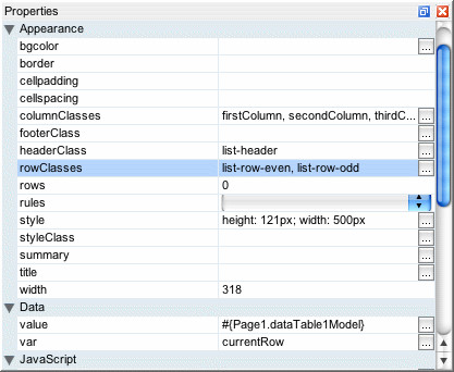
go back to your page, select the data table component, and look at its
rowClasses property. In Creator we default this value
to list-row-even,list-row-odd. This property is a list
of CSS style classes. When the component is rendering the table, it
will cycle through the list of classes, assigning the current style
class to a given row. There's nothing magical about odd and even here;
we could have had three styleclasses, "one", "two" and "three", and
if the rowClasses property was set to "one,two,three" then the html
table rendered for the Data Table would take three rows to cycle
through the styles.


With that out of the way, let's return to the question of how to
deal with column widths or column text alignment. Some users have
tried to set the CSS "text-align" properties on the cell contents
themselves, e.g. Output Text components embedded in the table.
That's not what you want; you need the alignment set on the table
cells containing the output texts. To solve that problem, we're
going to use the same technique as the one used for table striping.
Just like the table component cycles through the
rowClasses style classes when writing out rows, it
has a columnClasses property it will cycle through
when writing out columns!


Let's say we want to have a table with three columns. We'd like the
first column to be 10% wide, the second column to be 30% wide, and
the third column to be 60% wide. Furthermore, we want the first column
to be right justified and the third column to be centered. To do
that, add a stylesheet section like this:


.firstColumn {
width: 10%;
text-align: right;
}
.secondColumn {
width: 30%;
text-align: center;
}
.thirdColumn {
width: 60%;
}

Then, for the Data Table or Grid Panel's columnClasses
property, add this value: firstColumn,secondColumn,thirdColumn
Notice how there's a dot/period in front of the style class names in
the stylesheet, but not in the class names in the style property.
That's all there is to it.


In the above screenshot I've also changed the header style to use a different
foreground color, background color and font size. Notice how some columns
are right justified, some are centered and some are left justified.


If you try to add pixel specific widths for particular columns, AND
you've set a total table width to a particular size, the pixel width
may not show up correctly at design time. That bug was fixed recently
and the fix will show up in patch 3. For now, use the "Preview In
Browser" action to see how the table renders in the browser instead.