WARNING: This blog entry was imported from my old blog on blogs.sun.com (which used different blogging software), so formatting and links may not be correct.
I've seen a number of users who want to either control the alignment
of text in columns, or control the relative widths or text wrapping
in the columns -- either for Data Table components, or the Grid Panel.
Before I explain how to do that, let me start by explaining the synergy
between JSF components and CSS2.
First, drop a Data Table component on the canvas. Notice how you get
a "striped" color scheme where alternating rows are lighter and darker?
That's not built into the component per se; this is done in Creator
through a combination of CSS and JSF. Go ahead and open the stylesheet
for your page; it's usually under the "Resources" folder, named
"stylesheet.css". You'll notice it has these two rules:
.list-row-even {
}

.list-row-odd {
background-color: #eeeeee;
}
As you might be able to guess from the names, these are the styles
applied to even and odd numbered rows. To see how this is wired up,
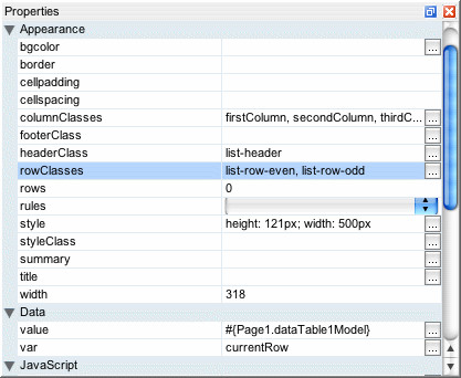
go back to your page, select the data table component, and look at its
rowClasses property. In Creator we default this valueto
list-row-even,list-row-odd. This property is a listof CSS style classes. When the component is rendering the table, it
will cycle through the list of classes, assigning the current style
class to a given row. There's nothing magical about odd and even here;
we could have had three styleclasses, "one", "two" and "three", and
if the rowClasses property was set to "one,two,three" then the html
table rendered for the Data Table would take three rows to cycle
through the styles.
With that out of the way, let's return to the question of how to
deal with column widths or column text alignment. Some users have
tried to set the CSS "text-align" properties on the cell contents
themselves, e.g. Output Text components embedded in the table.
That's not what you want; you need the alignment set on the table
cells containing the output texts. To solve that problem, we're
going to use the same technique as the one used for table striping.
Just like the table component cycles through therowClasses style classes when writing out rows, it
has a columnClasses property it will cycle through
when writing out columns!
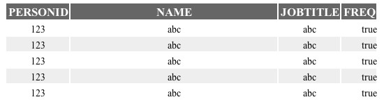
Let's say we want to have a table with three columns. We'd like the
first column to be 10% wide, the second column to be 30% wide, and
the third column to be 60% wide. Furthermore, we want the first column
to be right justified and the third column to be centered. To do
that, add a stylesheet section like this:
.firstColumn {
width: 10%;
text-align: right;
}
.secondColumn {
width: 30%;
text-align: center;
}
.thirdColumn {
width: 60%;
}
Then, for the Data Table or Grid Panel's
columnClassesproperty, add this value:
firstColumn,secondColumn,thirdColumnNotice how there's a dot/period in front of the style class names in
the stylesheet, but not in the class names in the style property.
That's all there is to it.
In the above screenshot I've also changed the header style to use a different
foreground color, background color and font size. Notice how some columns
are right justified, some are centered and some are left justified.
If you try to add pixel specific widths for particular columns, AND
you've set a total table width to a particular size, the pixel width
may not show up correctly at design time. That bug was fixed recently
and the fix will show up in patch 3. For now, use the "Preview In
Browser" action to see how the table renders in the browser instead.
No comments:
Post a Comment